 Yehey! They're finally printed. The biggest cost to us here is probably the printer ink - because we had to go far and wide to actually find a store that actually still carries cartridges for my printer of more than 6 years (or more, even). That actually set us back a week.
Well now they're finally done! Ingredients: - Oncewed.com for inspiration - Epson Stylus Photo 830 - Ivory board paper 80gsm c/o National Bookstore - Coin pockets c/o National Bookstore - Adobe Illustrator and Photoshop - Patience - Fonts from www.dafont.com / www.abstractfonts.com - A whole lot of patience and LOVE! We're off to distribute them in the coming week, while waiting for our formal invitations. Which reminds me, I need to follow-up on the proof...
1 Comment
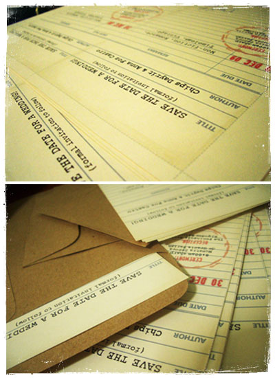
 I got this idea from Oncewed.com where one of their featured weddings distributed paper bags with the loose petals towards the end of the church ceremony. I guess anything is better than the guests trying to hold as many petals as they could on curled palms during the recession. It's also a more organized / less messy way of distributing them. Not to mention, cute! Anyways, I also designed a seal that I'll just have printed on sticker paper. One of the w@w bride-to-be's mentioned that they had some labels printed in Megamall... so that's probably where I'll get these done. So there. Tada! I'm just too happy flexing my Adobe muscles. On a side note, we'll be in Subic this coming weekend. So that's two days out of the preps calendar. Chips will be running the full marathon (that's 42 kilometers, aka 4++ consecutive hours of running). I'm going to be there for moral support (waiting at the finish line). Wish us luck!  Sudtipos - the creator of to-die-for scripts and very sexy yet simple prints. I absolutely love going through their site. Drool at fonts. Download the closest freebies searchable on the web or get "pirated" ones. You know, those versions where serifs are a wee bit fatter, or flourishes are a wee bit shorter (or not there at all). Sometimes I actually think if 60 USD is worth it. But then again, I'm not getting any income for all the design playing. I'm just getting a brain-high.  let⋅ter⋅press [let-er-pres] –noun 1. the process of printing from letters or type in relief, rather than from intaglio plates or planographically.    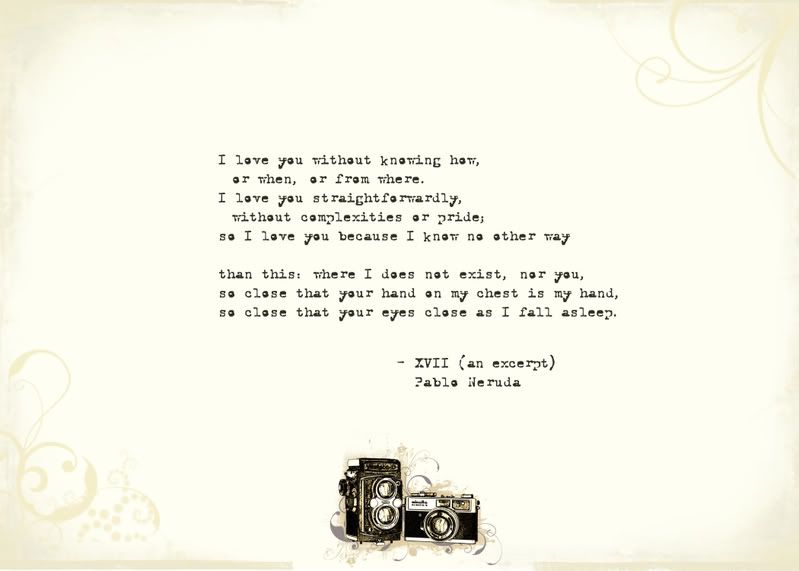 Almost done with the invitations! Here's a teaser. This would be the opening page for the invite set (click for bigger view). It still carries the non-monogram, the antique paper and the type-written text. If the image can't be viewed or is still blurred, below is the text inscribed: Another Photoshop project. I'm ripping the "library card" idea off from another wedding that I found through oncewed.com and just made some little tweaks so it could talk about the theme. When I saw the idea, I felt like I could totally relate to it - I love the smell of old books, the library, reading. Chips probably not as much, but he was generally okay with the idea. Yay to me! We'll probably just print these ourselves, since we're not making too many. The index card of rules also came from the same inspiration source, and I thought it was a perfect and light-hearted way to set some reminders without coming off too dictatorial. 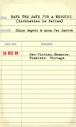 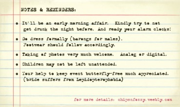  Just work in progress. This is me playing around with Photoshop using online tutorials. I'm having an art director from the agency have a crack at it as well, and I can't wait to see what he's come up with. | UsFozzy will do most of the writing in this blog. Chips will be contributing some pictures and ideas. Together, we're awesome (and we've been so for over 8 years)! ArchivesJanuary 2010 CategoriesAll |
 RSS Feed